So, as the seasons change one of my favorite thing is to look through different magazines and see what they believe will be the next new, 'hot' colors. I love fall. The weather is temperate in our corner of east Texas, and the long awaited introduction of cardigans, scarves, boots, and most of all warm browns and deep jewel tones that mirror the landscape. Ahh, I just cannot wait. I am already trying to beckon on the fall by pulling out my fall pieces, but it doesn't seem to be working.. Anyway, below are the color predictions for Fall 2012.
So what does this mean for ACC? Well, we are always looking to stay on trend with our table and overall decor, as well as hope to encourage people to incorporate these colors into their parties! As soon as these colors came out, I started searching throughout Pinterest to see what other people were doing to incorporate these colors into their events. Here is my interpretation of the Pantone Fall 2012 Color Predictions...
French Roast
 |
| {via} |
 |
| {via} |
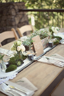
French roast, almost like a greyish brown, is gorgeous! Like I said before, I love warm earth tones and french roast definitely falls into the mix. Personally, I think french roast would be the perfect vehicle to display an accent color or even wonderful by itself with only very neutral accents like in the first photograph. The most common use of french roast, in my opinion, has been through wood accents. Wood accents have been a very popular trend in events this year. I've seen wood used as side tables, chargers, menu boards, the works. Love love!
Honey Gold
 |
| {via} |
I'm in love with this gold. Paired with the beautiful blush flowers and accents, you have such a rich, elegant, and luxurious feel. Looking at this photograph, makes me think this should be a table set in a beautiful palace somewhere, and I want to be invited to sit at that table.
Pink Flambe
 |
| {via} |
Oh my goodness. This. is. so. fun. This just screams fun to me.
 |
| {via} |
I'm sorry, I couldn't help myself. I love this deer head.
Tangerine Tango
 |
| {via} |
Love tangerine! Among the photos I could find on Pinterest, tangerine and pink flambe seem to be the favorite pairings, but personally, I would love to see a tangerine and french roast pairing or maybe even a tangerine and titanium (below) pairing for this fall.
Ultramarine Green
 |
| {via} |
Oh my goodness, this green. What a beautiful color for any and all skin tones, as well as a beautiful pairing partner with other colors, like the sunny yellow in the photograph above.
Bright Chartreuse
 |
| {via} |
Chartreuse is a toughy for me, but I really love the chartreuse featured in the photograph above.
Olympian Blue
 |
| {via} |
 |
| {via} |
 |
| {via} |
If you can't tell, this color blue is my favorite. It is my favorite color to wear, and I absolutely love incorporating it into any type of decor that I possibly can.
Titanium
 |
| {via} |
Another very beautiful, rich tone that could be used either as a base to highlight an accent color, or stand, beautifully, alone.
Rhapsody
 |
| {via} |
I love this light purple color for fall. I'm a sucker for a deep, jewel-toned purples, but this just feels so fresh and almost organic and soothing in a way.
Rose Smoke
 |
| {via} |
 |
| {via} |
A beautiful blush pink like this could never be wrong. I adore the soft pink. It's so feminine, sweet and girly. -Imagine rose smoke plus titanium... I know what you're thinking- love, love, love.
I hope you enjoyed my interpretation of these fall colors. The next question for you is, "How will you interpret them in your next party, and how can ACC help you accomplish the look and feel for your dream party?"


No comments:
Post a Comment